Control and effort in API design
Building graphical user interfaces is hard.
One of the reasons is poor API design. Specifically poor balance of control vs effort over a set of use cases. Effort is the time it takes to implement a use case using an API. Control is how fine-grained the commands that we send to an API can be.
This issue of balance is not GUI-specific, it’s a generic problem in API design. This post is my attempt to understand the dynamics between control and effort using examples from frontend development.
The lost art of geometry
Here’s a puzzle. Let’s say we have two rectangles. One is taller and wider than the other. We want to place and vertically center the smaller rectangle inside the larger one.
The height of the larger rectangle is h1. The height of the smaller one
is h2. How do we solve for x, where x is the vertical offset of one
rectangle against the other?
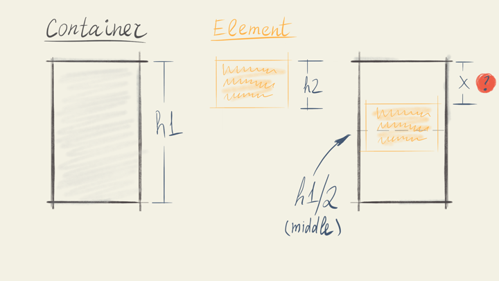
In case you’d like to take a shot at it, here are a few options:
1. x = h1 / 2
2. x = (h1 - h2) / 2
3. x = (h1 + h2) / 2
See the answer
2. x = (h1 - h2) / 2
You see, it’s only one line of Math — that old unsexy programming language of spreadsheets.
If we transfer this problem from the world of forms into the world of HTML documents, it’s still solvable. This time with CSS — that new cool styling language of browsers.
.container {
  display: flex;
  align-items: center;
}
A slightly harder puzzle
Let’s make it a titbit harder. Now we’d like to tie the upper side of the
smaller rectangle to a grid. The rest is the same. We are still centering
the smaller box within a larger one, only this time rounding the value of
x to the closest grid row.
The height of a grid row is h3.
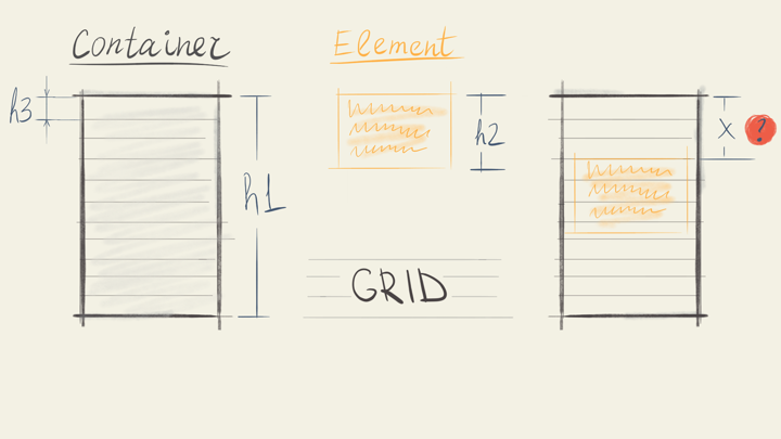
Here are the options:
1. x = h3 * round((h1 - h2) / (2 * h3))
2. x = h3 * (h1 - h2) / 2
3. x = h3 * floor((h1 + h2) / 2)
See the answer
1. x = h3 * round((h1 - h2) / (2 * h3))
The solution is more complex this time, but it’s still Math and it’s still just one line. How would we do this with CSS? With iOS AutoLayout? Android Layout?
Sadly, there’s no way.
Who’s got the rhythm?
Those puzzles were inspired by real-world use cases for GUIs. The last one is a model of Vertical rhythm, a concept from typography.
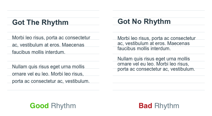
Why is it so hard to implement? After all, we’re just arranging pixels on a screen. Pixels are squares. Squares are geometric shapes that we should be able to manipulate with ease. But we can’t.
A pixel is not a pixel
The problem is that a pixel on the screen is represented by something else in the system. It’s a DOM element, a View, an Object. It’s a thousand different things. What a pixel actually is is hidden from a developer.

In case of a browser it leads to all sorts of inconveniences:
- We are limited to the use cases that browser vendors consider common;
- We can’t write tests for layout or paint stages of rendering;
- Testing anything UI-related requires spinning off a browser. It’s like going groceries shopping on a private jet.
The wrong tradeoff
At the beginning of the article I said that the core issue here is:
Poor balance of control vs effort over a set of use cases.
Let’s unpack that statement.
The set of use cases of an API is everything a dev might want to implement. Browser vendors give us abilities to make GUIs. Any interface we might want to build is included in the set of use cases. It’s a large set.
Effort is the time it takes to implement a use case using an API. The more time it takes (for the person who already knows how the API works) the harder it is to use.
What I mean by “control” is how fine-grained the commands that we send to an API can be. In a graphics API, the levels of control could vary from changing properties of a component to changing properties of a shape to manipulating a pixel.
Amount of control we have is often determined by the level of abstraction we’re working with. The lower the abstraction the closer to hardware we are the more control we have.
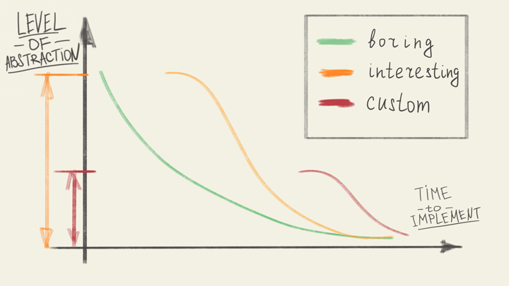
It might seem that these two parameters, effort and control, are in direct conflict. The more control we have the more work we have to do. That is true, but it’s not all the truth.
As we move through the set of use cases the effort/control relationship changes. Showing one paragraph of text on a screen is easy to do with high-level browser APIs. It’s more and more effortful as we use lower level abstractions. Imagine coding a shader that draws characters of a given font.😱
Now let’s remember the example with the grid at the beginning of the article. Some use cases are plain impossible with high-level abstractions. Until API vendors consider a use case like that common enough, there’s no way we can implement it. At the same time, it’s not hard to make it using a high-control low-level API like OpenGL.
We’re slowly approaching the topic of API design. What are our options as a system designer when we face these kinds of tradeoffs? One obvious choice would be to prioritise one part of the equation over the other.
#UseThePlatform
Historically browser vendors prioritized minimizing effort over a set of common use cases. Browsers were decent at displaying documents with text and images on a desktop screen.
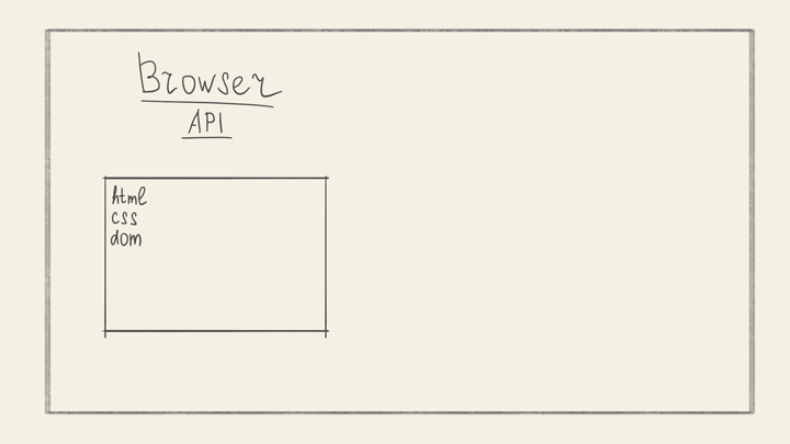
Issues began when publishers and developers started asking for more. Supporting several platforms, different screen resolutions and densities. Building apps, games and other interactive media. It all required giving more access, more control to the makers.
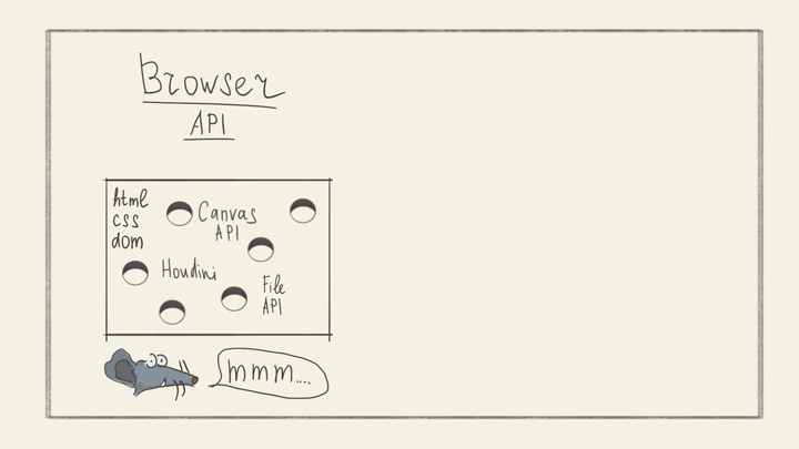
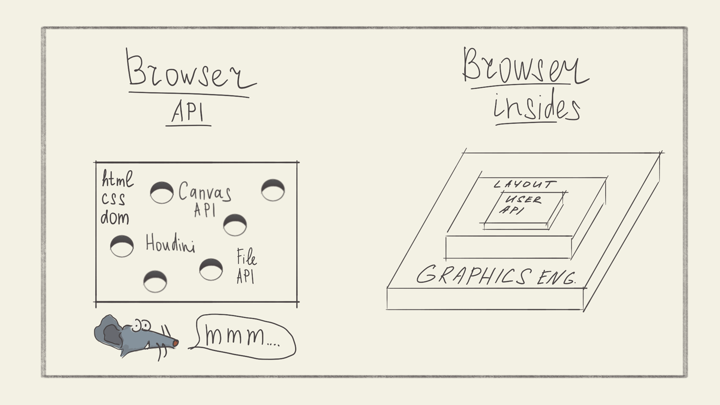
That led us into the situation we are in today. There’s that flat API for common cases with a bunch of “holes” drilled into it to get to the lower-level functionality browsers have (and had for a while).
That’s why we can draw arbitrary shapes on an HTML canvas, but we can’t make those shapes a proper part of DOM, CSSOM or AOM (Accessibility Object Model).
We can use different layout models like flexbox or grid. But there’s no way we can unit-test the results of a layout stage.
We can to some degree control what a browser stores in its cache, but we can not save, retrieve and manipulate file contents in our code. At some point, we will be able to do that thanks to the File API. But it would be a separate construct, on a side, not related to Cache, Service Workers, Application Cache and other APIs. Even though all of those have the same foundation lower down the stack.
The hard way
Prioritizing either effort or control is one way to solve this conflict. There’s another way. The much harder way.
As designers of an API we can decide to expose it in layers. To give access to both low-level and high-level primitives. The tricky part is to do it in a way where a developer can mess around with a lower-level API without the result being “excluded” from the rest of the system.
Flutter is a good example of that kind of approach. Flutter is a cross-platform mobile development platform made by Google.
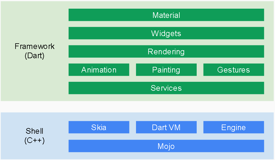
Because of the layered structure of the Flutter API we are able to:
- Make a widget that is responsible for laying out its children;
- Unit-test our custom layout widget without starting an emulator;
- Make a widget with a custom paint method. For example, we can make a button with a custom shape, interesting shadow or coloring effect;
- That custom widget will still remain a button in terms of gestures it accepts, accessibility and other properties;
- We could unit-test the paint operation too. Again, just by running the code in a Dart VM, no emulator required.
Going back to our grid example from the top of the article. Here’s the code of the widget that centers its children vertically, tying them to a grid:
Offset getPositionForChild(
  Size containerSize,
  Size childSize
) {
  final h1 = containerSize.height;
  final h2 = childSize.height;
  final h3 = rowHeight;
  final rowsCount = ((h1 - h2) / (2 * h3)).round();
  return Offset(0, rowsCount * h3);
}
As you can see, the code in Flutter looks very similar to what we came
up with using Math: x = h3 * round((h1 - h2) / (2 * h3)). That’s another
benefit of working on the right level of abstraction: the way we express
our intention is straight-forward.
Here’s how the resulting app in Flutter looks like:
Closing thoughts
These principles of effort-vs-conflict, layered-vs-flat helped me solve some of the recurring issues in my work. It’s a useful lens to look through.
Sometimes we get caught up “drilling” our flat high-level API to extract the functionality that is burried underneath. That’s the sign that we might need to change our approach. Remember there’s a much larger set of use cases that we might be able to support with a lower-level API. Extracting each use case one by one leads to bloated design and more work from you as an API designer.
If you’d like to learn more about different approaches to GUI development, check out this Code Podcast episode.
This article is based on an API Design talk I made. You can find the video of that talk here.